Friday, 18 February 2011

I have decided to keep the name of my restaurant as Mutton Quad. The theme of my restaurant will be based around 3D type, including the logo. I have decided to use 3D type rather than 2D, as i have never experimented with this in any of my other projects and i feel as though now is the perfect time. Another reason why i have decided on using 3D type is because after researching into what 'Mutton Quad' actually is i found many samples of metal type, which is also 3D. I plan on taking this old method of typography and giving it a modern twist, making it more irrelevant to my target audience.

These are some examples of the metal type i came across.


On this picture you can see how the typography is 3D. This is where i initially thought of having my restaurant themed around 3D typography, which will also work nicely with my title 'Mutton Quad'. Now i will start to look at modern 3D typography and see where that takes me.


Monday, 7 February 2011

Swiss Style

Swiss Style, also known as the International Typographic Style, is a graphic design style developed in Switzerland in the 1950's. This style emphasises cleanliness, readability and objectivity. Characteristics of the style are asymmetric layouts, use of grids, sans serif typefaces like Akzidenz Grotesk. The style is also associated with a preference for photography in place of illustrations or drawings. 


Many of the early International Typographic style works featured typography as a primary design element in addition to its use in text, and it is for this that the style is named.


Examples of Swiss Typography


Inspiration - existing restaurants

Researching into some existing restaurants i came across some pretty extreme designs.  The restaurant below is actually situated up a tree. This unusual restaurant started life as an ad campaign for Yellow, a New Zealand company similar to the Yellow Pages. The idea was to build a restaurant in a tree using only resources listed in the company’s directories. 

Personally, I find this restaurant very bazar, but this is the reason why it makes the restaurant rememberable and makes people want to go and eat there. 


Tree House Restaurant (New Zealand)


Another extreme restaurant is situated in Miami and is known as the BED restaurant. BED is known to be one of the most relaxing dining spots in the city of Miami. The restaurant contains large mattresses covered with mounds of pillows, allowing you to relax with a partner or a small party. At this restaurant you place your shoes in a cubby and put on BED’s complimentary socks.  Trance music and slow-motion videos are projected onto screens attempting to soothe you, as do creative drinks like the blackberry julep, a new, fresh-fruit take on the mint julep.

I like the idea of having slow motion videos projected on to certain screens in the restaurant. This is an idea i will keep in mind for my typographical restaurant. I also like the idea of the restaurant having its own "soothing" drink. This to me helps enforce the theme of the restaurant to a hole new level.

BED Restaurant (Miami)


The Undersea Restaurant is situated 5 metres below the sea level of the Indian Ocean. This is surrounded by a coral reef and is encased in clear acrylic, giving the diners a 270 degree view of panoramic underwater views. This restaurant is known to be the first ever transparent undersea restaurant in the world.
I think the idea of this restaurant is really awesome, but i personally would not like to wine and dine 5 metres under the sea! 
Undersea Restaurant (Maldives)


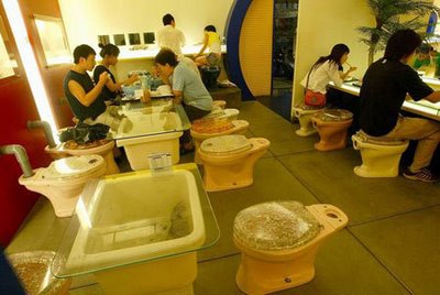
In this restaurant, you sit on a toilet and eat from a toilet shaped bowl. How bazar does that sound? Although i would never make the seats in my restaurant into toilets seats this restaurant has opened my mind to the extremes of what the interior of my restaurant could look like.
Modern Toilet Restaurant (Talwan)


Target Audience

I am wanting my restaurant to appeal to the younger generation (18-25 years). This means that the name of my restaurant must be eye catching and rememberable. I am not to keen on the working title "Mutton Quad", so i will look into the different areas of typography and see if i can gain any names from that.

I plan to traget this audience by making the theme of my restaurant very funky and modern. To achieve this look i will be researching into existing restaurants, to see the layout and identity they have decided to use. Also i will look into the different styles of typography to gain inspiration.

Friday, 28 January 2011

Inspiration

Flicking through a design magazine called "The Book Of Inspiration" i came across some typography that caught my eye. This is because of how the typography has got its own individual theme. This concept could be used in my typographically designed restaurant depending on what route i choose to go down. 


Monday, 24 January 2011

What is Mutton Quad?

Below is a definition on what the term "Mutton Quad" stands for.

basically, the unit of measurement used in typography is known as em. This unit defines the proportion of the letters width and height with respect to the point size of the current font. However, another unit of measurement called en is also used in typography. This is half the width of an em. So in theory one em in a 16 point typeface is 16 points, making the en 8 points. With an em quad being hard to distinguish from an en quad, printers sometimes called it a mutton quad.

An "em-quad" is a metal spacer used in printing presses. It is referred to by this name because it is composed of a square one em on each side. In these old-fashioned printing presses, this allowed the insertion of an em space ( ) character between other typographical characters. It is also occasionally referred to as a "mutton quad".


Here is some 30 pt. Gill Sans metal type. All of the lower case letters are present, plus number and punctuation.